
目录

- .githubUpdate swift.yml4年前
- AAInfographicsFix #432 => Support the click event callback of the plot background2年前
- AAInfographicsDemo.xcodeprojUpdate project.pbxproj3年前
- AAInfographicsDemoUpdate MainVC.swift2年前
- AAInfographicsDemoTestsUpdate Stack Overflow avatar link5年前
- AAInfographicsDemoUITestsUpdate Stack Overflow avatar link5年前
- .gitignoreUpdate .gitignore3年前
- AAInfographics.podspecUpdate AAInfographics.podspec3年前
- CHINESE-README.mdUpdate CHINESE-README.md3年前
- LICENSEUpdate to Xcode 10 / Swift 4.27年前
- Package.swiftChange supported iOS version be iOS 10.0 🚀3年前
- README.mdUpdate README.md3年前
- _config.ymlSet theme jekyll-theme-merlot5年前
邀请码
版权所有:中国计算机学会技术支持:开源发展技术委员会
京ICP备13000930号-9
京公网安备 11010802032778号
AAInfographics
English Document 🇬🇧 | 简体中文文档 🇨🇳
There is the link of Objective-C version of
AAChartKitas followhttps://github.com/AAChartModel/AAChartKit
Preface
AAInfographics is the
Swiftlanguage version of AAChartKit which is object-oriented, a set of easy-to-use, extremely elegant graphics drawing controls,based on the popular open source front-end chart library Highcharts. It makes it very fast to add interactive charts to your mobile projects. It supports single touch-drag for data inspection, multi-touch for zooming, and advanced responsiveness for your apps .Features
🎂 Environment friendly. Support
iOS、iPadOSandmacOS. Totally supportSwiftlanguage, and there are more types version such asObjective-Clanguage version AAChartKit 、Javalanguage version AAChartCore 、Kotlinlanguage version AAInfographics . To get more details you can see the source code links list.🚀 Powerful and easy to use. It supports
column chart,bar chart,area chart,areaspline chart,line chart,spline chart,radar chart,polar chart,pie chart,bubble chart,pyramid chart,funnel chart,columnrange chart,arearange chart,mixed chartand other graphics. Support for more chart types is planned.📝 Modern Declarative Syntax. Unlike previous imperative programming techniques, drawing any custom chart in AAChartKit, you don’t need to care about the inner implementation details which is annoying && boring. Describe what you want, you will get what you described.
🎮 Interactive and animated. The charts
animationeffect is exquisite, delicate, smooth and beautiful.⛓ Chain programming. Supports
chain programming syntaxlike SwiftUI and Jetpack Compose.🦋 Minimalist.
AAChartView + AAChartModel = Chart. The AAChartKit follows a minimalist formula: Chart view + Chart model = The chart you want, just like the powerful and beautiful charts framework AAChartKit.🖱 Interaction event callback. Support for monitoring user click events and single finger move over events, which can be used to achieve double charts linked-working and even multiple charts linkage, as well as other more complex custom user interaction effects.
Appreciation
Installation
CocoaPods (recommended)
to your project Cartfile.
carthage bootstraporcarthage update.AAInfographics.Manually (old school way)
AAInfographicsDemoAAInfographicsinto your project.Usage
AAChartViewAAChartModel🌹🌹🌹Congratulations! Everything was done!!! You will get what you want!!!
Update chart content
if you want to refresh chart content,you should do something as follow.According to your actual needs, select the function that fits you.
aa_onlyRefreshTheChartDataWithChartModelSeries)Infographics sample
line chart
column chart
bar chart
special area chart one
special area chart two
special area chart three
polar chart
radar chart
pie chart
bubble chart
scatter chart
arearange chart
step area chart
mixed chart
More graphics
Special instructions
Support user click events and move over events
you can monitor the user cick or finger move over events message through implementing delegate function for AAChartView instance object
The received user click or finger move over events contain following content
Monitoring user click events can achieve a variety of custom functions. For example, you can implement Double Charts Linkage through user click event callbacks. The example effects are as follows
Support for customizing the style of chart
AATooltipthroughJavaScriptfunctionAs we all know, AAInfographics support using HTML String. Most of time, the
headerFormat、pointFormat、footerFormatHTML string is enough for customizing chart tooltip string content, However, sometimes the needs of APP is so weird to satified, in this time, you can even customize the chart tooltip style throughJavaScriptfunction.For example
you can get the customized tooltip style chart like this👇
you can get the customized tooltip style chart like this👇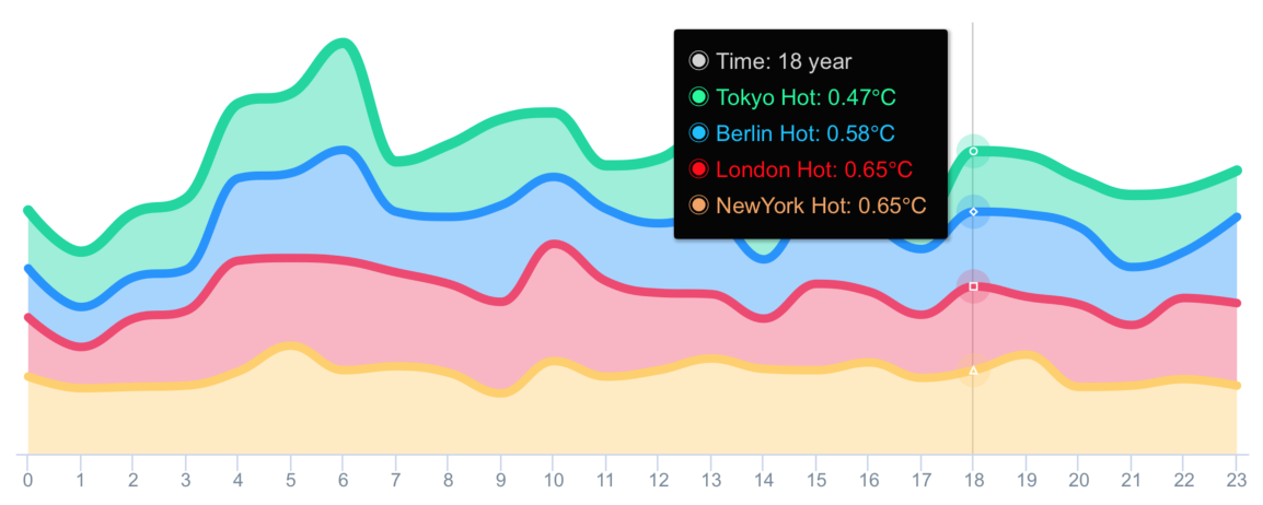
Support value range segmentation
chart with value range segmentation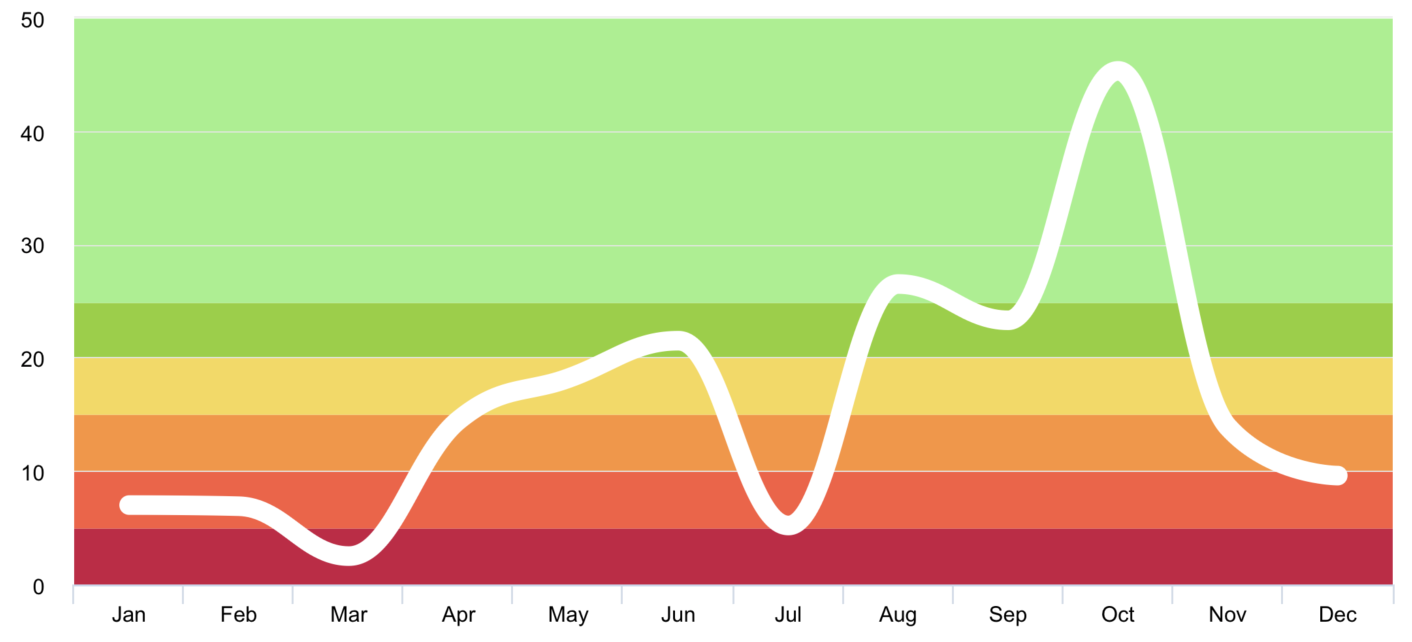
bands 🎀chart with value range segmentation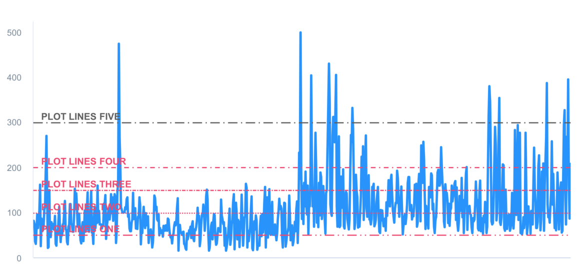
lines 🧶chart with value range segmentation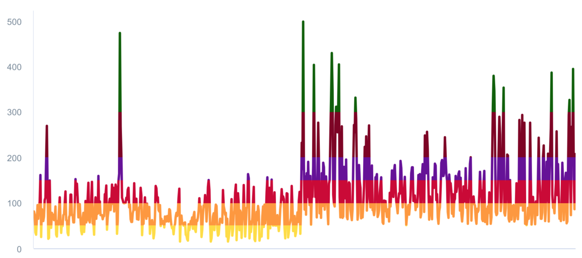
zones 🧱Support scrolling update chart data
Support data sorting with animation effect
Supported chart type for now
Supported zoom gesture types for now
Suppported line dash style types for now
Supported animation type for now
Here are the ten concrete animation types of AAInfographics
About AAChartModel
AAChartModel:chart basic properties instruction
AAChartType.AAChartModel:chart all properties list
Created By
Source Code Links⛓
Normal Versions
Pro Versions
Pro Versions are more powerful data visualization frameworks that support more types beautiful chart like bellcurve, bullet, columnpyramid, cylinder, dependencywheel, heatmap, histogram, networkgraph, organization, packedbubble, pareto, sankey, series, solidgauge, streamgraph, sunburst, tilemap, timeline, treemap, variablepie, variwide, vector, venn, windbarb, wordcloud, xrange charts and so on.
LICENSE
AAInfographics is available under the MIT license. See the LICENSE file for more information.
Contact
Todo list
series) content dynamicallycolumn chart、bar chart、pie charts、scatterplot chart、bubble chart, etcAAOptionsmodel object properties freely